










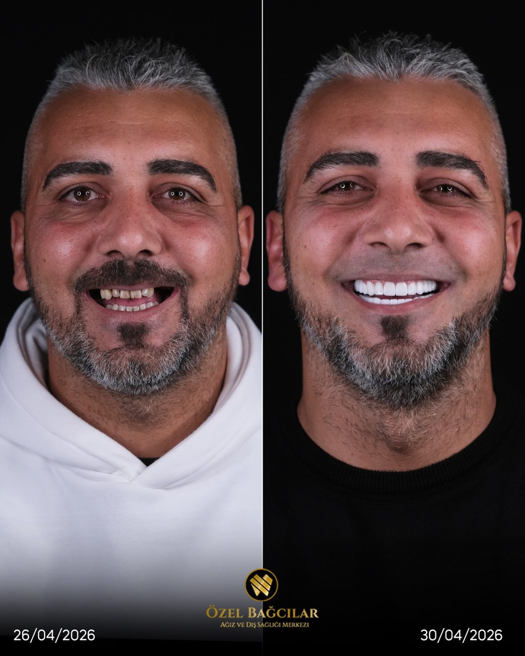
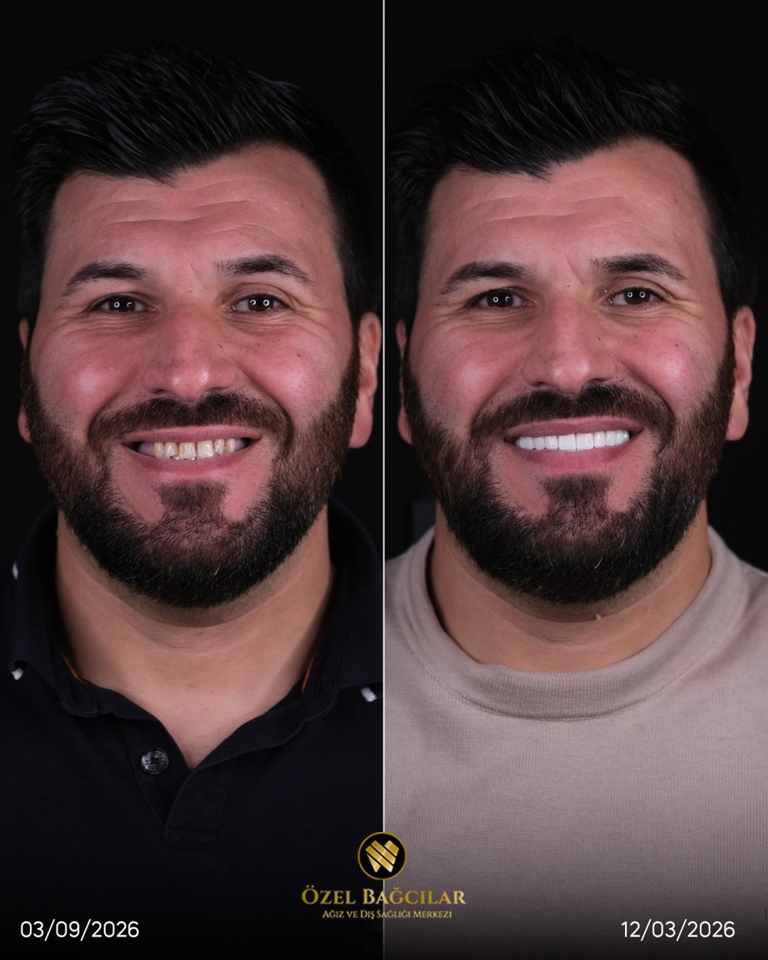
Why a Photograph of Teeth Is So Unreliable
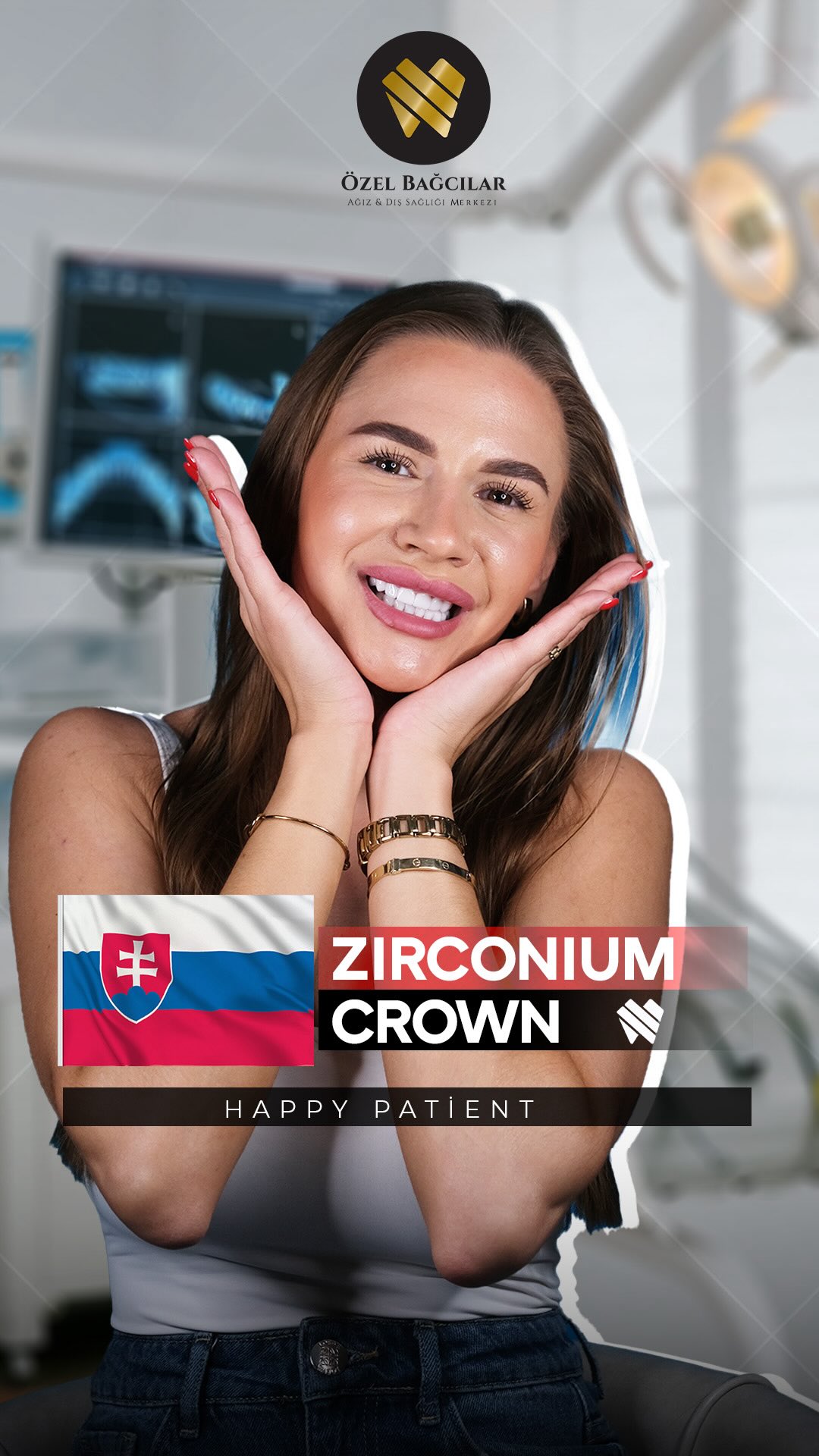
Teeth are glossy, translucent and highly reflective, which makes them one of the hardest subjects in photography. Small changes in how light reaches them produce large changes in how they appear.
A tooth photographed under warm domestic lighting looks noticeably yellower than the same tooth photographed with a ring flash. Nothing about the tooth has changed. This single variable accounts for a substantial proportion of the improvement visible in poor galleries.
Translucency compounds it. Enamel transmits light, so the background behind and around the teeth affects their apparent shade. A dark oral cavity behind the teeth makes edges look greyer; a well-lit one makes them look brighter.
Then there is the surrounding face. Skin tone, lip colour and the amount of gum visible all affect how white teeth appear by contrast. A photograph taken after a summer holiday flatters teeth that have not changed at all.
None of this requires bad faith. A before photograph taken quickly at the first appointment and an after photograph taken carefully at completion will differ systematically, in the same direction, every time.
Ceramic behaves differently from enamel under a flash as well. A restoration that looks convincing in clinical lighting can read flat in daylight, which is why the material chosen for front teeth matters more to a photograph than most people assume.
The First Check: Are the Two Images Comparable?
Before looking at the teeth at all, look at everything around them. If the two photographs were not taken the same way, the comparison tells you nothing regardless of what the teeth look like.
Lighting is the first thing. Look at the shadows, the highlights on the tooth surfaces, and the colour of the lips and skin. A warm, flat before image and a cool, bright after image is a lighting change presented as a treatment result.
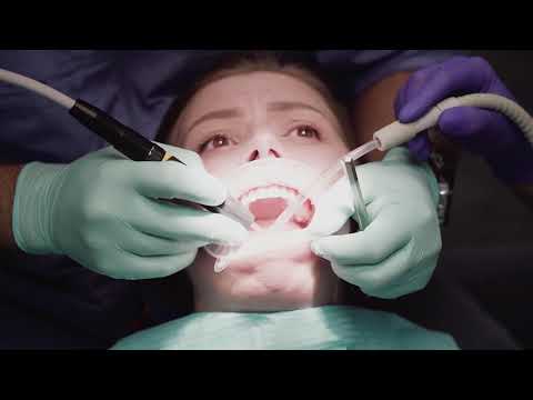
Retraction is the second. Cheek retractors hold the lips back and expose the teeth fully; a natural smile does not. A before photograph of a relaxed smile next to an after photograph with full retraction shows more teeth, more gum and a different smile line.
Angle is the third and the most subtle. Photographing from slightly below lengthens the upper teeth and reduces visible gum; from above does the opposite. Check whether the camera is level with the mouth in both.
Where all three match, you are looking at a real comparison. Where they do not, you may still be looking at good dentistry — you just cannot tell from these two images.
What a Genuine Pair Looks Like
Clinics that document properly follow a standard protocol, and the results are recognisable once you have seen a few.
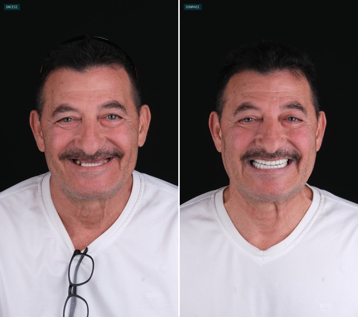
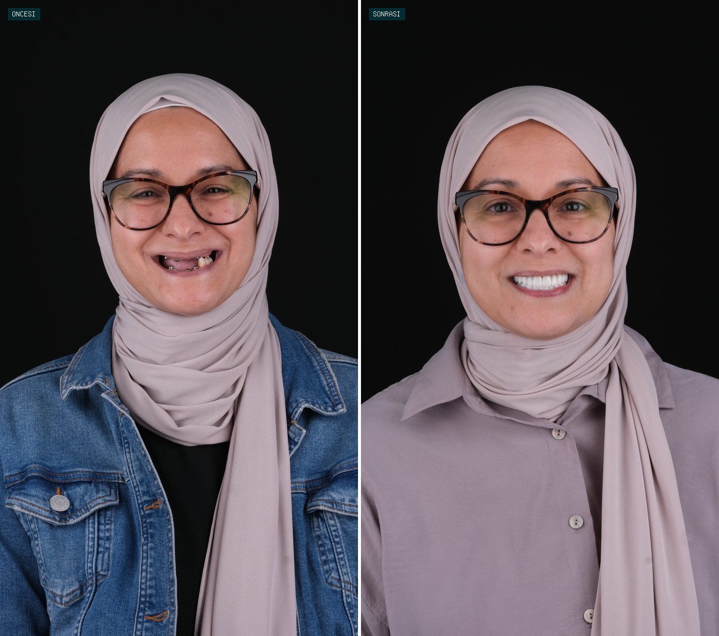
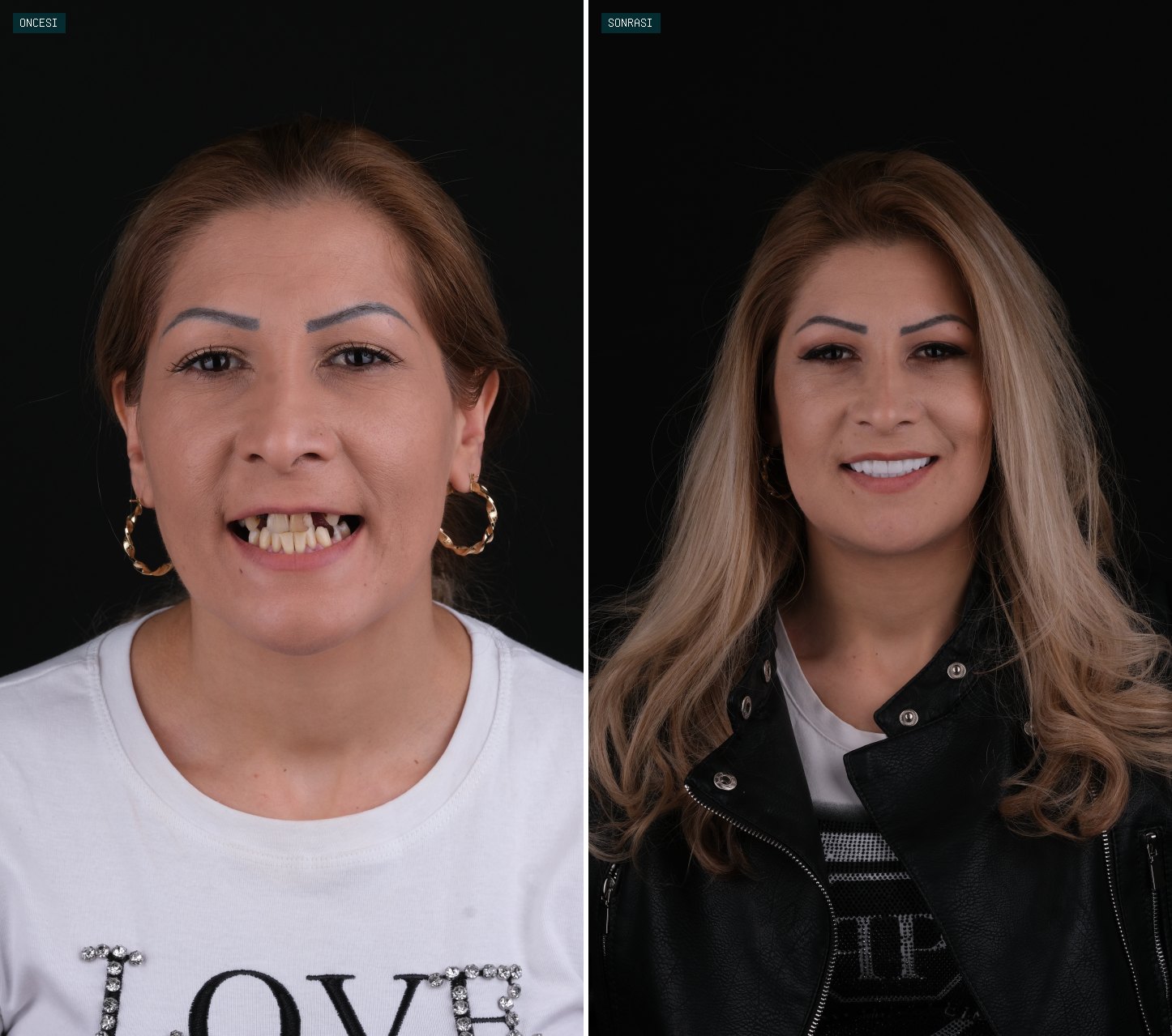
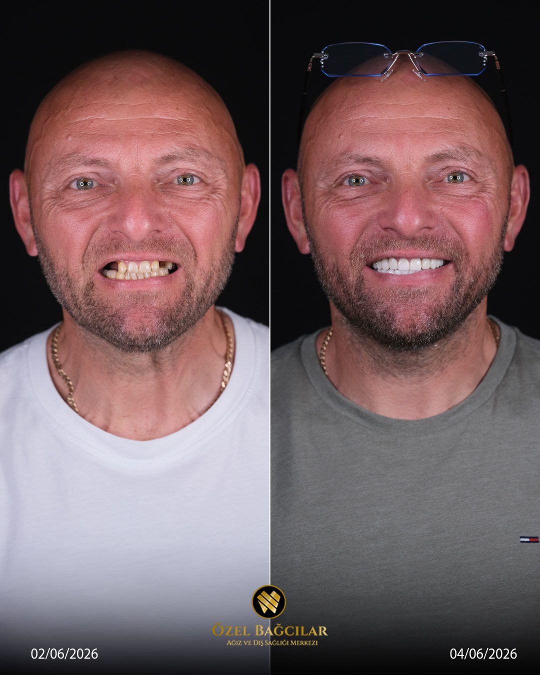
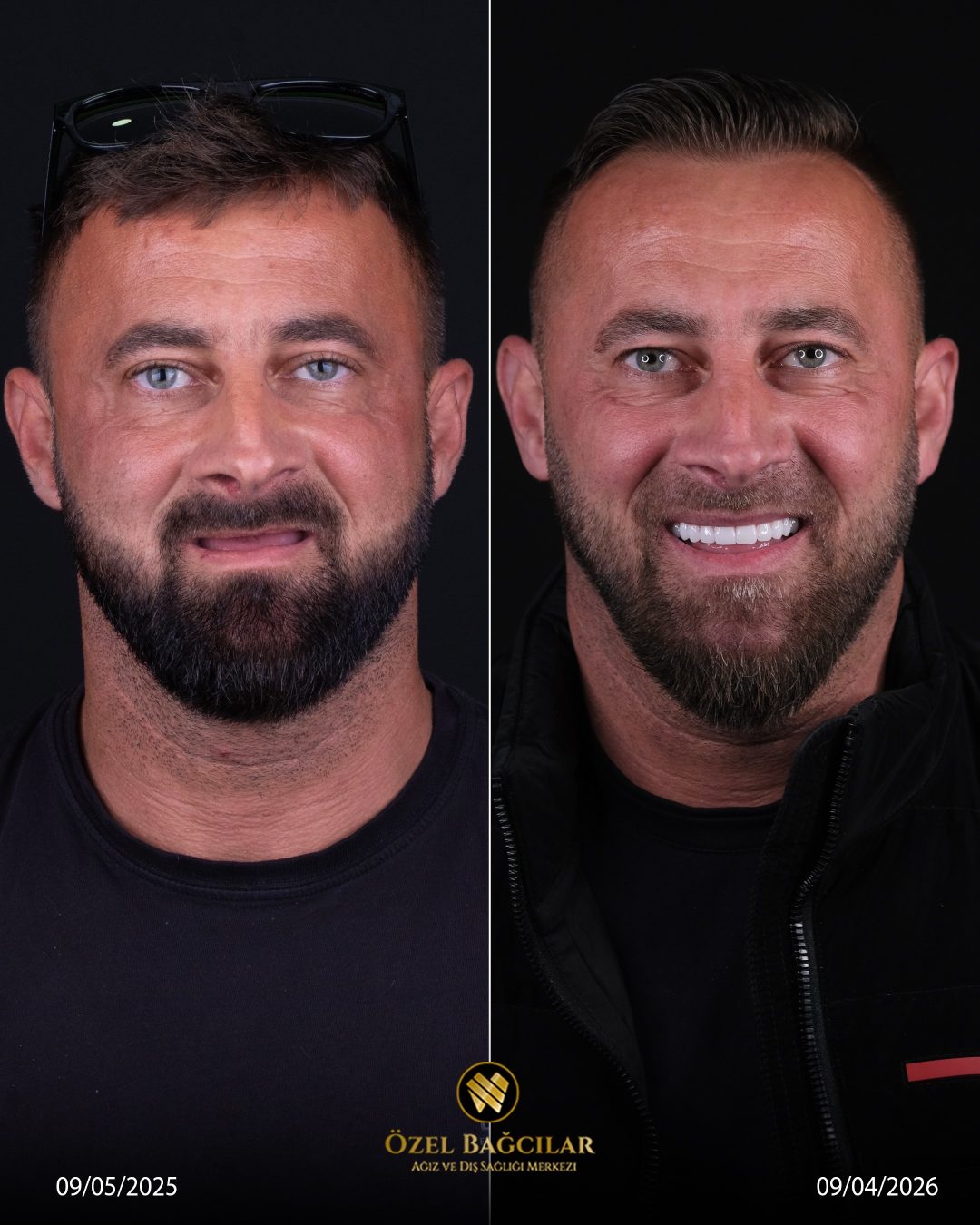
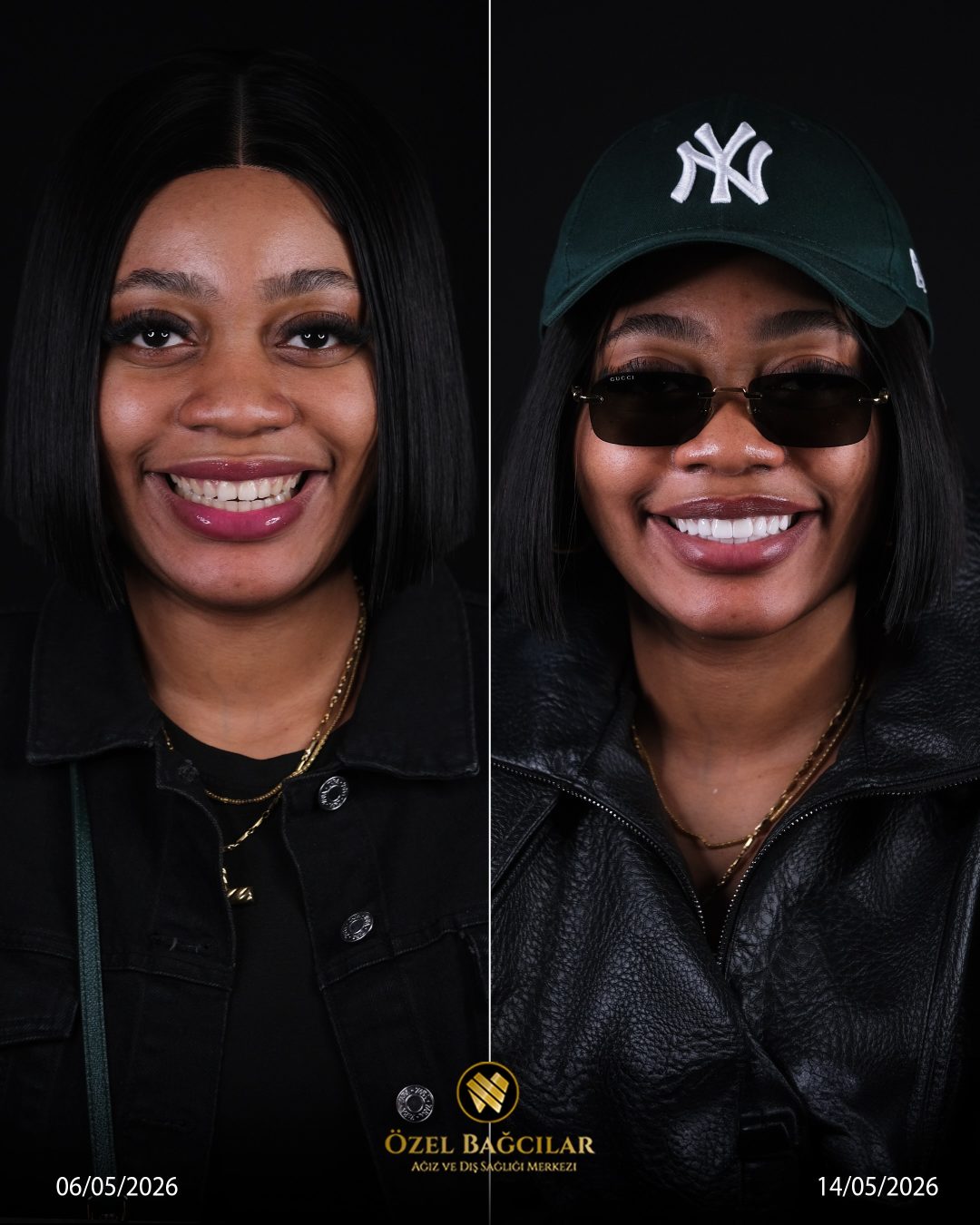
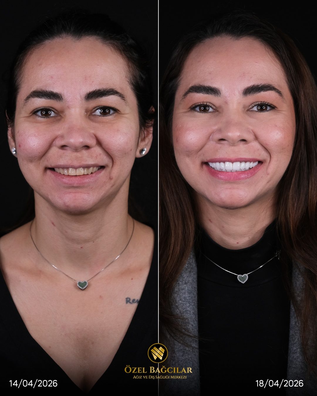
The framing is identical between the two images. Same distance, same angle, same amount of face in shot, same retraction. Often the images can be flicked between and everything except the teeth stays in place.
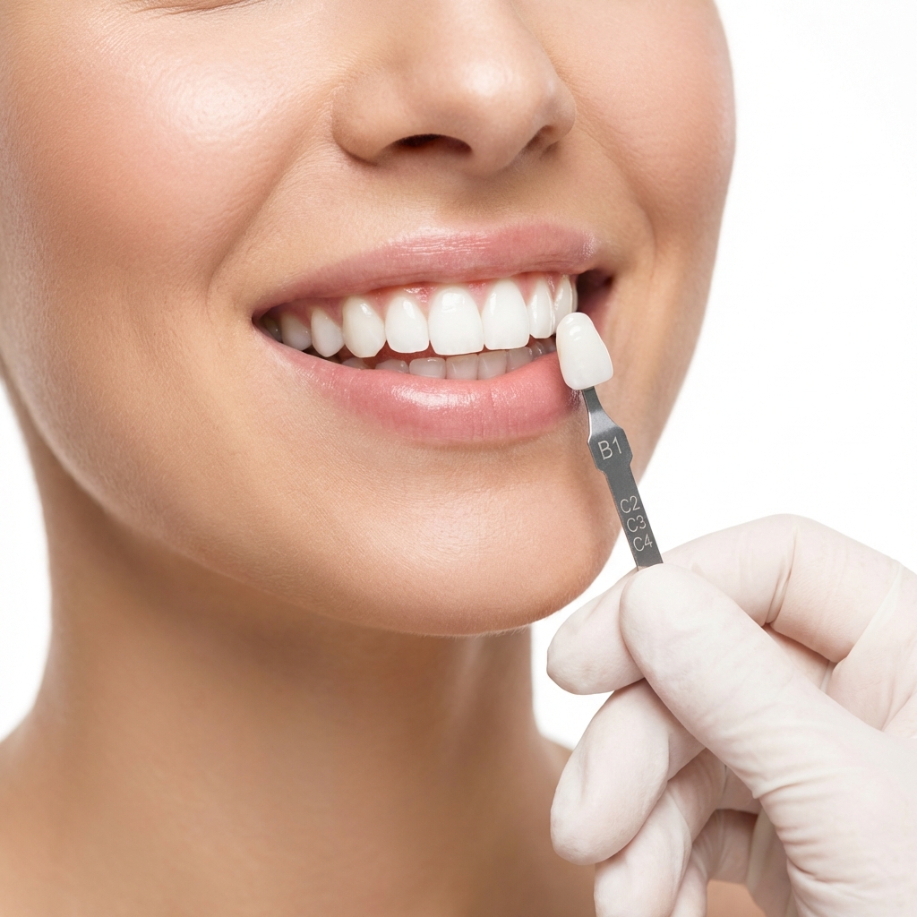
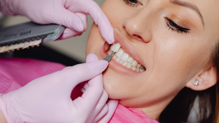
A shade tab sometimes appears in shot — a small ceramic reference held beside the teeth. Its presence in both images makes the comparison objective rather than impressionistic, and it is a strong signal of a clinic documenting rather than marketing.
Multiple views appear rather than one. A front view, two side views, and a retracted view of the arches. Single-image galleries are showing you the one angle that worked.
And the before image is not flattering. A clinic confident in its results does not need the starting point to look worse than it was — which is itself a reason to be suspicious of before images that look unusually dark or unusually badly lit.
The Tells of an Edited Photograph
Retouching leaves traces, and the traces are in the details that editing software handles badly rather than in the teeth themselves.
| What to look at | Genuine | Edited |
|---|---|---|
| Tooth surface texture | Fine ridges, subtle irregularities, varied reflections | Uniformly smooth, plastic-looking |
| Variation between teeth | Slight differences in shade and shape tooth to tooth | Identical white across every tooth |
| Translucency at the edges | Slightly greyer, more translucent biting edges | Solid opaque white to the edge |
| Gum line | Natural scalloped contour, visible texture, slight asymmetry | Smooth, uniform, sometimes blurred where it meets the tooth |
| Gum colour | Varies slightly across the arch | Uniform pink, occasionally oversaturated |
| Edges against the lip | Sharp, consistent with the rest of the image focus | Soft or haloed where whitening was brushed on |
| Reflections in the teeth | Consistent with the light source visible elsewhere | Absent, or inconsistent between teeth |
The gums are the most reliable single indicator. Whitening a photograph digitally almost always affects the gum line where it meets the tooth, and the result is a slight blur or halo that natural images do not have.
Uniformity Is the Result, Not the Editing
There is a category of image where nothing has been retouched and the teeth still look artificial, and it is worth separating from the editing question.
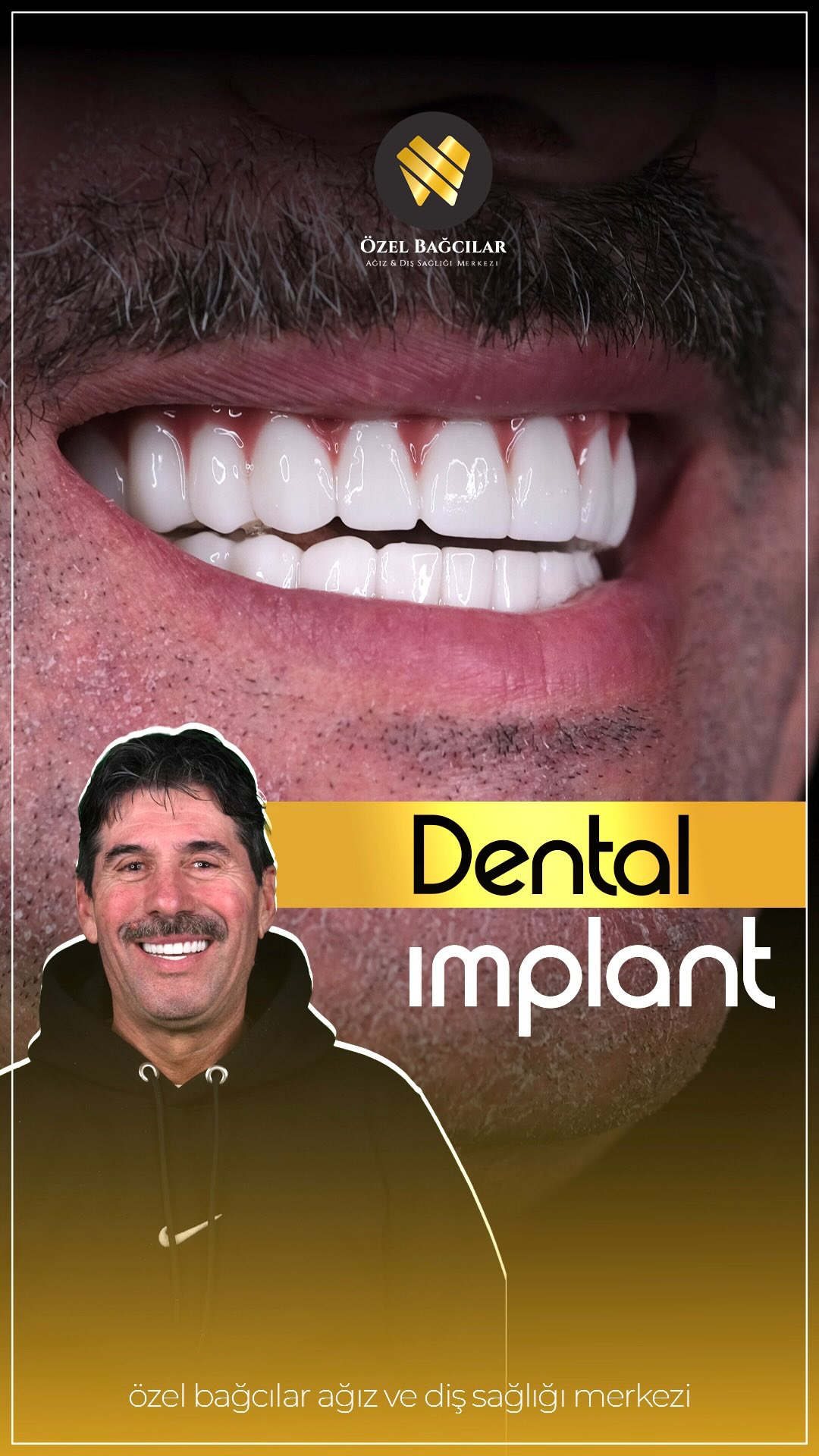
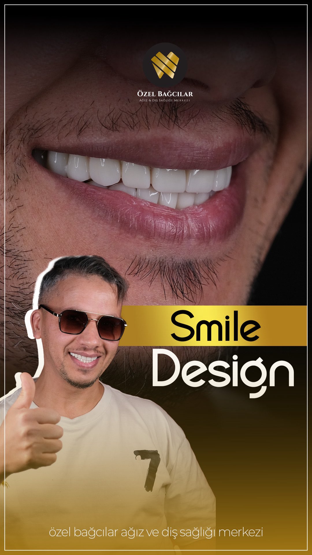
Natural teeth are not identical to each other. Central incisors differ from laterals in shade and translucency; canines are usually slightly darker and more saturated; edges are more translucent than necks. That variation is what the eye reads as real.
A result where every tooth is the same flat white with the same shape and the same edge is not a photographic artefact. It is a design decision, and it is the single most recognisable signature of poorly planned restorative work.
The same applies to the edge line. Natural upper teeth follow the curve of the lower lip; a flat line across all six front teeth is a design choice that reads as artificial from across a room.
So a gallery full of identical, flat, uniformly bright smiles is telling you something accurate about the clinic's aesthetic — what a considered design actually involves sets out what should have varied.
Gum proportion is the other place uniformity shows. Where every tooth in an after photograph has an identical gum height, that arch has usually been contoured to a template rather than to the face — how contouring should be planned sets out what the natural variation looks like.
What to Look For Beyond the Teeth
The most informative parts of a dental photograph are frequently not the restorations, and experienced clinicians look at these first.
The gum margins. Where a restoration meets the gum, that junction should be invisible and the tissue should look healthy — pink, firm, scalloped. Red, swollen or bulging tissue in an after photograph indicates a margin the gum is reacting to.
The papillae — the small triangles of gum between teeth. These should fill the space completely. Dark triangles between restorations suggest the contact points were placed wrongly, and they are difficult to correct afterwards.
Proportion between teeth. Central incisors should be the widest and most prominent, laterals slightly smaller and set back a fraction, canines turning the corner of the arch. Where all six are the same width, the design ignored this.
And the relationship to the face. The midline between the front teeth should be vertical, and the amount of tooth showing should suit the lip. A technically well-made set of restorations can still be wrong for the face they are in.
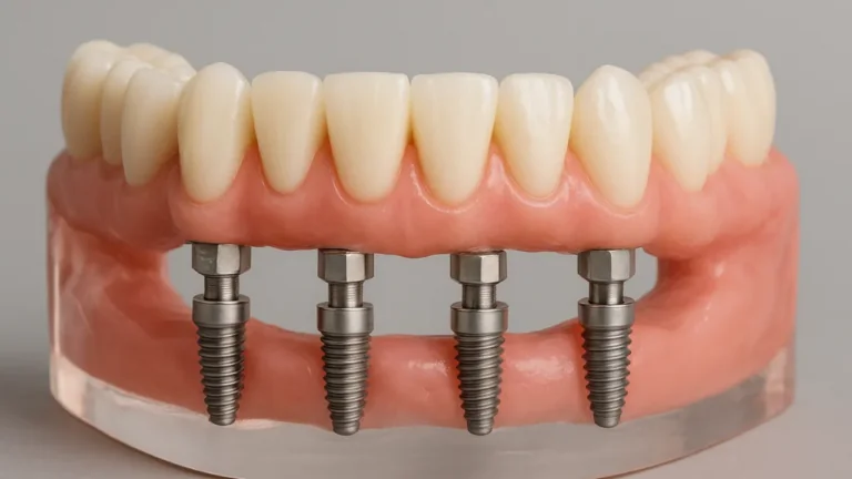
Where implants are involved, look at the gum around the crown specifically. A natural emergence — the crown appearing to come out of the gum the way a tooth does — is one of the hardest things to achieve, and the abutment choice is usually what decided it.
What a Photograph Cannot Show You
This is the harder limitation, and it applies equally to the most honestly photographed gallery in the world.
It cannot show how much tooth was removed. Two identical-looking results, one achieved with minimal-preparation veneers and one with full crowns on healthy teeth, are photographically indistinguishable and clinically very different.
It cannot show whether the treatment was correctly indicated. A photograph of twenty new crowns does not reveal whether four would have sufficed, or whether alignment would have achieved the same result without preparing anything — as the coverage comparison sets out.
It cannot show the margins. Whether the restoration edges are accurate, sealed and correctly contoured determines longevity, and none of it is visible in a photograph taken at conversational distance.
And it cannot show time. Everything is at its best on fitting day. What the same mouth looks like at five years is the interesting photograph, and almost nobody publishes it.
It also cannot show what the teeth were like underneath. A dramatic transformation of heavily damaged teeth and a dramatic transformation of sound ones look identical in a gallery, and only one of them was necessary — the cases that come back for correction frequently began as the second.
The Photographs Worth Asking For
Since galleries are curated by definition, the useful move is asking for something the curation did not anticipate. All of these are reasonable requests.
- A case similar to yours specifically, rather than the best case available.
- Multiple views of the same case — front, both sides, retracted.
- A case photographed a year or more after completion.
- A case where alignment was done rather than restoration.
- A case where the clinic recommended fewer teeth than the patient asked for.
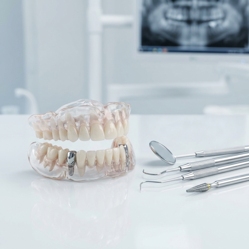
- Radiographs alongside the photographs, if the patient consented to that.
The fourth and fifth are the most diagnostic. A clinic whose entire gallery is full-arch restorative work either treats only that, or reaches for it regardless of the case.
The sixth is unusual and revealing. Radiographs show margins, bone levels and how much tooth remains under a crown — everything a photograph hides. Very few clinics publish them and the ones that do are making a point.
Patient consent limits what can be shared, and that limit is legitimate rather than evasive. What is not legitimate is having no long-term documentation at all.
Ask what the clinic photographs routinely rather than what it publishes. A practice that takes a standardised set at every consultation has records; one that photographs only finished cosmetic cases has a portfolio.
That distinction shows up in what you receive at the end. Baseline photographs taken before treatment belong in the records you take home alongside the radiographs, and they are the only way anyone can later judge what changed.
Stock Images and Borrowed Cases
A small number of clinics use photographs that are not theirs, and this is worth checking because it takes under a minute and settles the question completely.
A reverse image search on any before-and-after pair will find it if it appears on other websites. Results showing the same image across several unrelated clinics in different countries answer the question definitively.
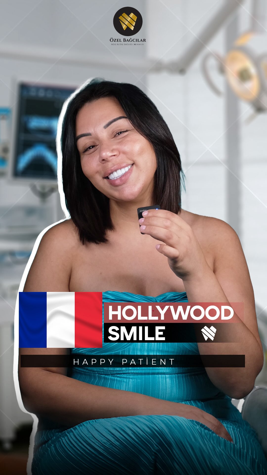
Stock dental photography also has a look: professionally lit, perfectly framed, models with unusually even features, and frequently no before image at all. It is used legitimately for illustration and dishonestly when presented as results.
Watch for images that are inconsistent with each other in style. A gallery where some pairs are clinical documentation and others are studio-lit portraits is mixing sources, and only one of those sources is the clinic's own work.
This is rare relative to the other problems on this page. Poor photography and flattering lighting are common; outright theft is not. It is simply the easiest thing to rule out.
Video Is Harder to Manipulate
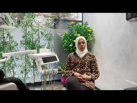
A short video of someone talking and smiling shows things no still image does, and the difficulty of faking it is precisely why it is less common.
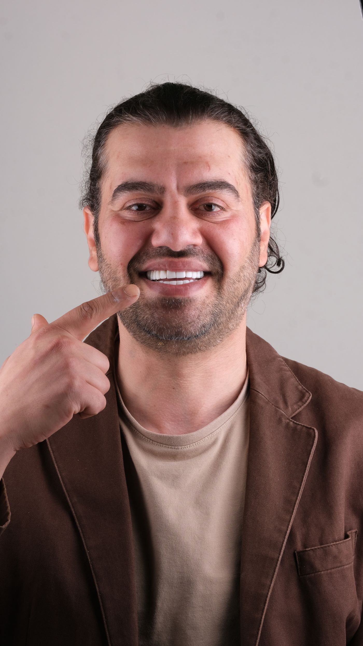
Movement reveals how the restorations behave in function — how much tooth shows when speaking, whether the smile line follows the lip, whether the teeth catch light the way natural enamel does as the head turns.
It also shows the result in ordinary lighting rather than under a ring flash, which is how everyone will actually see it. A result that looks excellent under clinical lighting and flat in a video is telling you something about the ceramic.
Retouching video is possible and considerably harder, and the effort required means it is rare in dental marketing. A clinic publishing video of speaking patients is making a claim it would be difficult to fabricate.
It is not a substitute for the documentation, though. Video shows appearance in motion; it still cannot show margins, tooth removal or whether the plan was right — which remains the question the written plan answers.
Using Galleries Well
A short method, applied consistently across every clinic you are considering, produces a far better comparison than reading any of them closely in isolation.
First, ignore the teeth and check whether each pair is comparable — lighting, retraction, angle. Discard any pair that fails, however impressive it looks. This alone eliminates a surprising proportion of most galleries.
Second, in the surviving pairs, look at the gums rather than the teeth. Healthy tissue, filled papillae, natural scalloped contour, no blur where gum meets tooth.
Third, look for variation. Slight differences between teeth in shade, shape and translucency indicate a design that respected natural form. Uniformity indicates one that did not.
Fourth, ask for what the gallery does not contain — a case like yours, a case at a year, a case treated conservatively. What comes back is more informative than everything published, and the same principle applies to reviews.
Look for a case that was treated with alignment rather than restoration too. A gallery containing orthodontic before-and-afters alongside the veneer cases is showing you a clinic that reaches for both, which is a more useful signal than the quality of any individual result.
The Result You Should Actually Want
Worth stating explicitly, because galleries train expectations in a particular direction and it is not always the right one.
The best restorative dentistry is not noticed as dentistry. It is noticed as someone looking well, and people who know them cannot say exactly what changed. That is a harder result to photograph and a much harder one to market.
It has slight asymmetries, because faces do. It has variation between teeth, because mouths do. Its shade is bright but within the range a natural tooth occupies. Its edge line follows the lower lip rather than running flat.
A gallery full of results like that looks less dramatic than one full of uniform brilliant white, and it is the better clinic. The dramatic gallery is advertising a look; the subtle one is advertising judgement.
Which you prefer is legitimately your decision, and it should be a decision rather than a default absorbed from advertising. It belongs in the design conversation, where the mock-up stage lets you see both on your own face before anything is prepared.
Shade is the part where this decision is most often made by default. Ask to see the proposed shade against your own face and in daylight before it is fixed — why the shade is decided before any ceramic is made explains why there is no second chance at it.
How We Photograph Results at Bağcılar
Standardised, because the alternative is producing images that flatter us and tell you nothing. Same camera settings, same lighting, same retraction and the same angle for before and after, so the pairs are genuinely comparable.
Multiple views for every case rather than the one that worked — front, both sides and retracted arches. Shade documented against a reference rather than described, because shade in isolation is not a measurement.
Nothing is retouched. No whitening, no smoothing, no gum correction. That means our images are sometimes less striking than galleries that have been edited, and it is the only version of the practice we are prepared to publish.
Photographs are taken at the consultation as a baseline whether or not you proceed, and they are yours — part of the records you take home along with radiographs and the written guarantee.
And we will show you a case similar to yours rather than the most impressive one we have, including where the answer was a smaller treatment than you came asking about.